
‘Which season are you?’ – Seasonal color analysis matches consumers to a palette that harmonises with their natural skin tone, undertone, and chroma to find out which clothing and makeup colors flatter them best. South Korean beauty culture helped turn personal colour analysis into a consumer service and a viral social media trend. This trickled down to make-up lines requiring a range of shades that is not just neutrals, but have personal shade choices including ‘tone-on-tone’ effects. Formulating the cosmetic color recipes that offer a perfect match to ‘Bright Winter’ or ‘Soft Spring’ requires more than just adding blue ultramarines and red iron oxides.
Limitations of Traditional Pigments
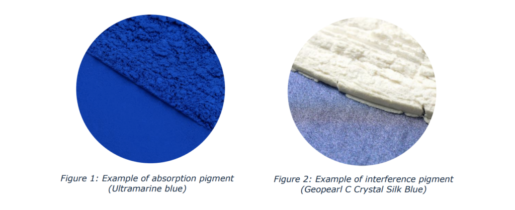
Traditional absorption pigments like iron oxides or lakes offer high coverage and opacifying effects. They create colour by absorbing part of the visible spectrum and reflecting the rest. The light is blocked from passing through with absorption pigments. When formulating glow effect and well-tailored products that reflect a skin-like luminosity, we cannot rely on these absorption pigments by themselves. For example, when trying to formulate a ‘Winter’ glow by simply using an opaque titanium dioxide base with blue ultramarines, the resulting formulation will sit on top of the skin. It creates a chalky, flat finish that masks instead of working with the consumer’s skin. Here is where interference pigments offer the transparency, luminosity and simplified colour matching.
How Interference Pigments Work
Interference pigments are mostly thin, flat particles with a (semi-)transparent substrate. Common substrates include natural mica, synthetic mica or borosilicate. The substrate is coated with a thin layer of metal oxides such as titanium dioxide. This is where the ‘color’ is introduced.
The thickness and refractive index of the coating determine which colors are seen. The interference colors are seen as part of the visible spectrum is reflected while the rest is transmitted through the layers. This is known as thin-film interference.
Figure 1. Example of absorption pigment (Ultramarine blue)
Figure 2. Example of interference pigment (Geopearl C Crystal Silk Blue)
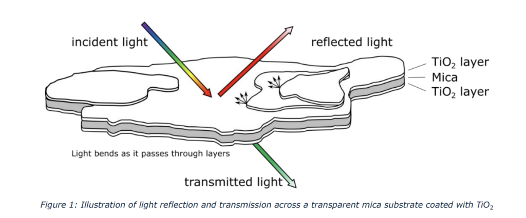
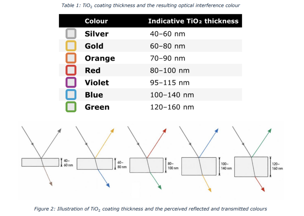
Mica coated with titanium dioxide is the most common structure, though more complex layer designs are possible with new technologies. Different colours are created by varying the thickness of the metal oxide coating. In the case of titanium dioxide, it starts as silver (white) and with increasing thickness the interference colours gold, red, violet, blue, and green are obtained.
Table 1. TiO₂ coating thickness and the resulting optical interference colour
Particle Size
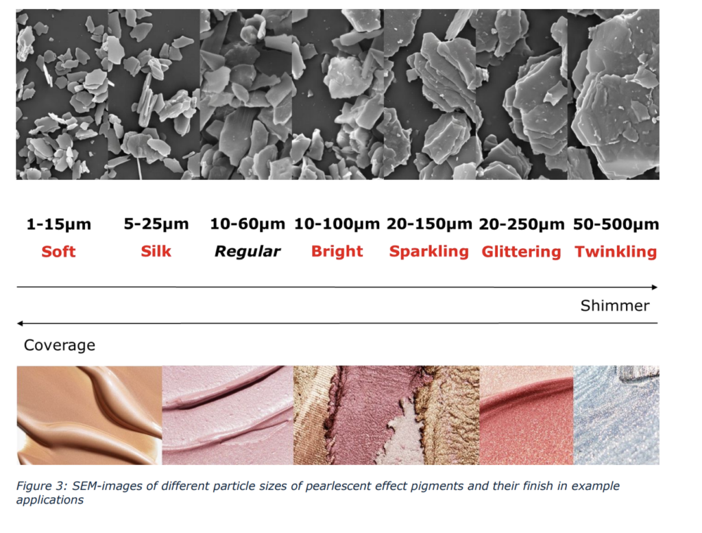
Alongside coating thickness, the particle size of the platelets defines the effect the pearlescent effect pigment offers. During the production of pearlescent pigments, the most widely manufactured bulk fraction falls within the 10–60 μm range. This serves as the industry standard for a classic ‘pearl’ finish. Smaller or larger fractions are separated from the rest of the bulk to create highly specific satin or high-sparkle effects.
Choice of Substrate
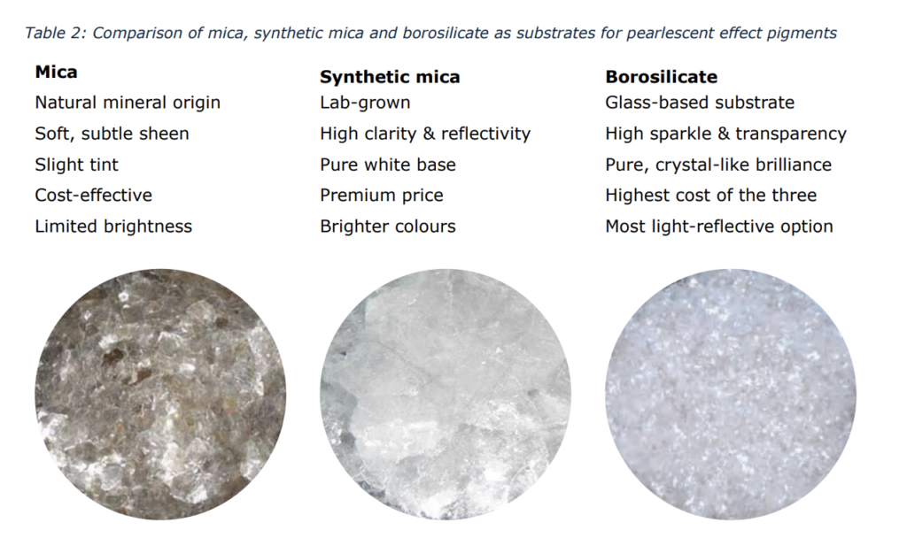
The choice of substrate affects colour purity, sparkle, transparency, and cost.
Natural Mica
This widely used substrate is used for traditional pearl and satin effects. It has a limited brightness as the material shows a more yellow-grey colour because the mineral origin material contains impurities like iron. For natural mica, responsible sourcing remains an important part as the supply chains can involve labour and community risks.
Synthetic Mica
Also known as Synthetic Fluorphlogopite, this substrate is produced by the crystallisation of melted high-purity minerals including quartz sand and potassium carbonate. A major difference in synthetic mica as compared to natural mica is the higher purity which results in more intense colours, higher transparency and better reflection.
Borosilicate Glass Flakes
The glass flake pigments are defined by their more premium substrate. These effect pigments are made from special glass with boron trioxide added to silica sand. The materials are melted, spun into ultra-thin film (2 or 5 μm thick) and broken into flakes. The borosilicate glass flakes have smooth surfaces, sharper edges and high transparency which gives them their extraordinarily high reflection and sparkle.
Pigment Strategies for Each Seasonal Palette
The base, interference colour, particle size and gloss will result together in a full colour recipe. To determine if the shades will flatter the consumer, a strategy for each season is required. The strategy has to keep in mind the luminosity, finish and contrast that go with the seasons’ natural colouring.
Spring: Warm, Light and Clear
Spring palettes are for bright skin tones that radiate when paired with clear, sun-kissed shades. These shades are usually peach, coral, warm pink, fresh green and light gold.
A useful strategy is to combine a clear absorption colour with a fine gold, orange or red interference pigment with a maximum size of 25 μm. The finish can be bright, but the particle size should remain controlled when the goal is freshness. A transparent, slight coloured base will make sure the interference colour is highly visible. However, there is an exception for the Bright Spring palette which could handle a larger sparkle up to 100–150 μm.
Summer: Cool, Light, Soft
Summer palettes are made for skin tones that look their absolute best in soft, delicate, and grey-leaning pastels. They are usually built around muted shades like dusty rose, mauve, lavender and soft blue.
For these soft palettes, fine-particle interference pigments are useful. Colours like blue, violet or silver can be used to cool the mass tone. However, please note to control the dose carefully as too much blue can give too much of a contrast effect for this soft palette. Diffusing fillers and low-gloss, opacifying effect pigments, with a maximum particle size of 15 μm, will flatter this season as it softens the overall appearance. A glossy satin finish up to 25 μm can still work for Light Summer as long as the colour remains soft and cool.
Autumn: warm, deep, grounded
Rich and deep skin tones with prominent golden or olive undertones will be enhanced by Autumn palettes which usually include terracotta, olive, warm brown, bronze and muted gold.
Opacity is more acceptable in this group as long as they are bright and not leaning to chalky shades. This palette thrives on gold interference with a bright base. Deep Autumn can pull off larger particle sizes up to 60 μm, giving a stronger metallic effect. Soft Autumn generally works better with a more diffuse surface.
Winter: cool, deep and high contrast
The Winter palettes are made for striking, high-contrast skin tones with distinct blue or cool pink undertones. They usually consist of black, berry, blue-red, emerald, violet and other clear, high-contrast colours.
This season can carry stronger interference and colour travel effects. Blue-green and violet-blue shifts are flattering as a clear visual, sparkling statement, especially for Bright Winter. For Cool Winter, a silk silver or blue interference with a small particle size will suit them.
Effect Strategy Summary
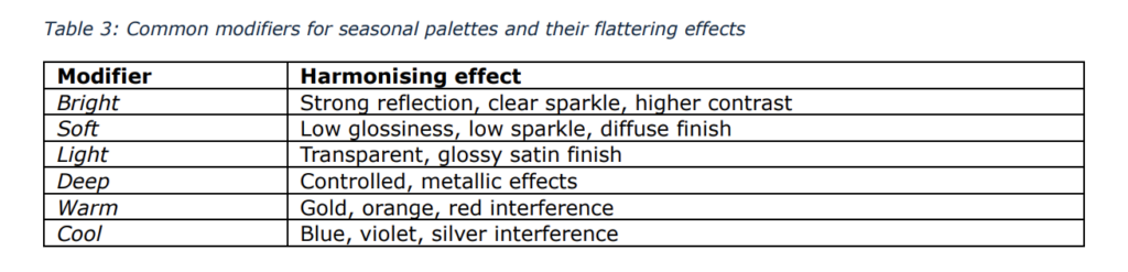
The palettes are not just defined by their colours, but also their finishes. The modifiers of the
seasons (Bright, Soft, Light, Deep) can offer more accurate flattering effects than the seasonal
palettes by themselves.
Formulation Tips
Interference effect pigments work differently from absorption pigments. In my experience, they are
more easily incorporated in formulations. However, they can only shine their brightest when we
treat them right.
Particle Size (Distribution)
Smaller particles will give more coverage and a satin or pearl finish, larger particle sizes offer a stronger sparkle with more visible points of reflection. An effect pigment with a narrower particle-size distribution will give the cleanest effect.
Processing
Pearlescent effect pigments consist of platelets. The fragile platelets can be damaged when processed under high-shear (homogenisation). Effect pigments need to be incorporated by using gentle mixing (e.g., propeller stirrer) to ensure optimal effect and reproducibility.
Base Colour
Dark coloured bases can increase the visibility of interference colors, however an opaque base may block it. Testing is necessary to find the right balance. When formulating complexion products, this means testing for the ‘tone-on-tone’ effect on several skin tones is also necessary. Skin is part of the optical background and can change how the same interference pigment looks in brightness and warmth.
Interference Color Blends
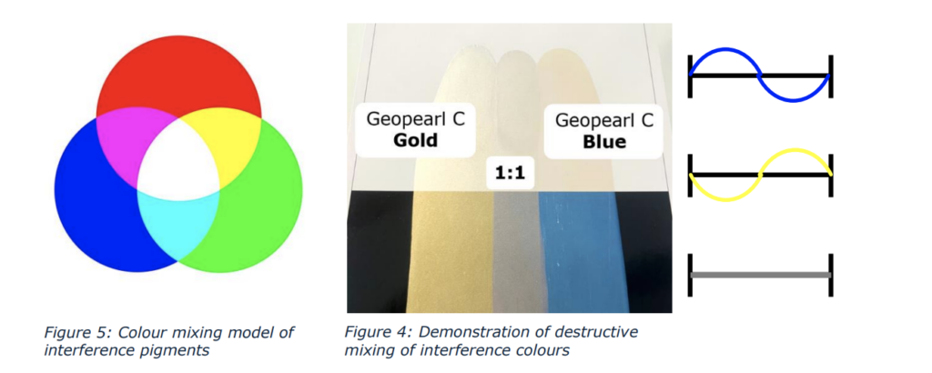
When combining different interference shades to create a wider range of shades, keep in mind they do not mix as predictably as absorption colors. Closely related interference pigments can be mixed, for example red and gold can create a coral shade, and a blue and green combination offers teal. However, interference colors that are complementary will neutralise the reflected colors and result in a silvery shade.
Color Forecasting
Consumer trends note that colors and make-up formulation will continue to lean into hyper-personalized and undertone-specific shades. This means that the demand for harmonizing colors and effects will only grow. The era of neutral one-shade-fits-all highlighters and bronzers is of the past. Rather than developing new colors, understanding the layers of colour recipes and the structures of pigments will be the basis of creating shades that deliver. Colors and their finish have to be formulated to precisely harmonise with consumers’ natural skin tones.